
![]() Estimated Read Time: 6 Minutes
Estimated Read Time: 6 Minutes
Sections in this article:
- What Are Custom Dashboards?
- Widget Types
- Create a Custom Dashboard
- Add a Widget
- Edit Dashboards
- Delete a Custom Dashboard
- FAQs
What Are Custom Dashboards?
Custom dashboards allow users to create tailored visualisations of contract and vendor data directly within Gatekeeper. Users can design dashboards composed of individual widgets, each representing a different data view or chart. Each widget can be configured independently, allowing users to build dashboards that surface the insights they need. This includes:
- Bar charts, column charts, and pie charts
- Counters with basic aggregation options (e.g. count, sum, average)

You can also add filters to each widget, like contract type, status, or date range. Users can save and return to their visualisations at any time.
Note: Every user can create their own custom dashboard. These dashboards are private and only visible to the creator.
When building dashboards, it’s important to understand the following key terms:
- Group: Defines how your data is broken down, for example, by contract status. This reflects how you want to compare data.
- Values: Defines what you are measuring. For example, the number of contracts, or total contract value.
- Filters: Controls which records are included. For example, you could add a status filter so that only Live contracts display in the chart.
- Label: The title displayed on the visualisation. For example, Annual SaaS Spend could be used to describe a chart.

Note: Sensitive data fields can only be used to group or filter data in custom dashboards if the user has the sensitive data permission.
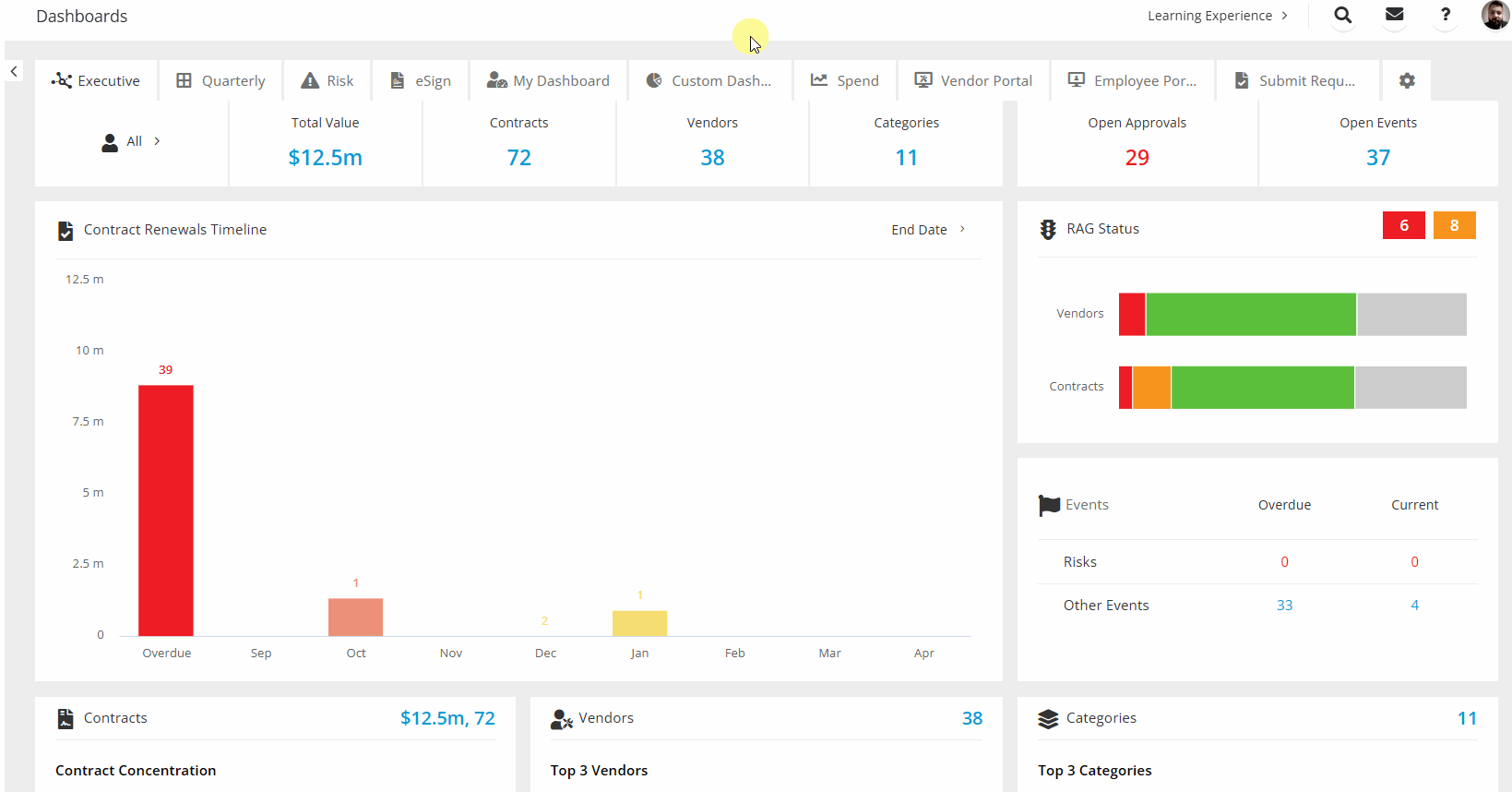
Widget Types
Custom dashboards can include a range of widgets to help you quickly interpret and act on your data. Each widget type is designed for a specific purpose, for example highlighting a single critical number, comparing categories, or understanding proportional relationships.
Counter
The counter widget provides a numerical insight into a single data point, for example, the number of active workflow cards. This shows one value (sum, min, max, or average), such as the sum of active workflow cards or average contract value.
Bar Chart
Horizontal bar charts compare groups side-by-side, with the flexibility to group by most data points, including custom fields. Each bar represents a category (e.g. status). The bar length shows the metric value (e.g. contract count, value).
Column Chart
Column charts display groups along the X-axis, with vertical bars showing values. They are ideal for comparisons or time-based data. Each bar’s height represents the value of a group (e.g. contract counts by month).
Pie Chart
Pie charts show how groups contribute to a whole, for example, how contracts are split by team or contract type. This chart displays these as percentages of a total value.
Note: You can click on any data point in a widget to open the relevant list view in the Vault, filtered to show only the records represented by that data point. Certain filter conditions, including active workflow cards and files cannot be applied in the list view; only compatible filters will be applied.
Create a Custom Dashboard
To create your own custom dashboard, follow the demonstration or see the steps below:
- From the navigation menu, click Dashboards.
- Click the cog icon.
- Click Add Dashboard.
- Enter a name for the dashboard, then click Save.
Add a Widget
To add a widget to a custom dashboard:
- From the navigation menu, click Dashboards.
- Click the tab for the relevant custom dashboard.
- Click Add Widget.
- Select the dataset (i.e. contracts or vendors), then select the data visualisation type.
- Click Next.
Depending on the chart type selected, you can define how your data should be grouped and calculated. See the following sections to learn more about each type of widget.
Counter
- From the Values dropdown, select the field you want to measure, for example, Contract Type.
- Select how the value should be calculated (e.g. Count, Sum, Average).
- If you want to filter the data included in the counter, click Add Condition, then enter the relevant criteria using the dropdown lists.
- Enter a display label for the widget, then click Save.
Bar, Column, or Pie Charts
- From the Group dropdown, select an attribute to group the data by. For example:
- Team to see results per department
- Contract Type to compare types of agreements
- End Date to show data by time period
- If you select a date-based attribute (e.g. End Date), select whether to group the data by month, quarter, or year.
- From the Values dropdown, select the field you want to measure, for example, Contracts or Value.
- Select how the value should be calculated (e.g. Count, Sum, Average).
- If you want to filter the data included in the chart, click Add Condition, then enter the relevant criteria using the dropdown lists.
- Enter a display label for the widget, then click Save.
Note: Sensitive data fields can only be used to group or filter data in custom dashboards if the user has the sensitive data permission.
Edit Dashboards
You can customise the layout of your custom dashboard by:
- Clicking and dragging a widget to a new position
- Clicking and dragging the edge of a widget to resize it

You can edit or delete widgets by expanding the 3 dots and selecting the relevant option.
Delete a Custom Dashboard
To delete a custom dashboard:
- Click the cog icon next to the other dashboard tabs.
- Click the
 delete icon next to the custom dashboard, then click Save.
 - To confirm your changes, click Save.
Note: This will permanently delete the dashboard and all of the widgets created in it. This action cannot be undone.
FAQs