
 Estimated Read Time: 6 minutes
Sections in this article:
Add a Workflow Description
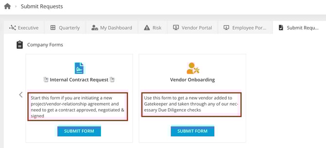
If your workflow forms are available on the Vendor Portal or Submit Requests Dashboard, you can add a description to the workflow that will appear on the relevant tile. This is useful for giving users extra context before opening the request form.
To add this:
- From the navigation menu, click Workflows.
- Expand the 3 dots on the relevant workflow, then click Edit This Workflow.
- Enter a description. You can also edit the Icon/Icon Colour and Label.
- Click Save.
Add Help Text within the Form
Note: If you're new to workflow forms, we recommend reviewing 📖 Set Up a Form within a Workflow before continuing.
There are various types of help text that you can add to sections and fields within workflow forms. This provides guidance and context to users as they complete the form.
These can be configured by clicking on a phase to edit it, then navigating to the Form section:

Labels
Form sections automatically use the section name as the label. However, form fields and phases can have customised labels.
Field Labels
By default, form fields display the same names used on a record in the Vault. However, you can change these to show a different label to form submitters.

The label will appear on the form above the input box, instead of the field name:

Phase Labels
You can also change the label for an entire phase. To do this, click on the phase to edit it, then enter a label.

Descriptions
Descriptions are available for phases, form sections and form fields. It is possible to add up to 2,000 characters to a description.
Phase Descriptions
To add a description to a phase:
- Click on the relevant phase to edit it.
- Enter a header if required, then enter a description and use the toolbar to apply formatting.

- Select the relevant radio button to determine how the description will display within workflow cards:
- Hide: The description will not be visible within workflow cards.
- Above: The description will appear above the form:

- Sidebar: The description will appear as a tab in the sidebar:

Note: In the Vendor Portal, phase descriptions are only displayed to vendor users for phases with Vendor Portal Submit Requests enabled. To display a phase description on phases with Vendor Portal enabled, see Vendor Portal Expert - Add Instructions to a Form.
Section Descriptions
To add a description to a form section:
- Click on the start phase to edit it.
- From Form, click the
 pencil icon on the relevant section to edit it.
 - Enter a description, then select the Display Description checkbox.

- Click Save to confirm your changes.
This will appear underneath the section name for users completing the form: 
Field Descriptions
To add a description to an individual form field:
- Click on the start phase to edit it.
- From Form, expand the 3 dots on the relevant field, then click the
 pencil icon.
 - Enter a description, then select the Display Description checkbox.

- Click Save to confirm your changes.
This will appear underneath the form label for users completing the form:

Tooltips
Tooltips are only available for form fields. A blue icon appears next to the field label, and when a user hovers over it, the tooltip text is displayed. If a link is added, it will appear after any tooltip text. The link will be underlined, clickable, and will open in a new tab for the user.

To configure a tooltip:
- Click on the start phase to edit it.
- From Form, expand the 3 dots on the relevant field, then click the pencil icon.
- Enter the tooltip in the Text field.
- If required, enter the URL in the Link field. Then, enter a label for the link in the Link Text field. If no link text is entered, the link will not appear in the tooltip.

- Click Save to confirm your changes.